This post is the tenth and final post in a series of oil painting project tutorials derived from coursework completed at Academie Noord in Brasschaat, Belgium. Projects were designed by Schilderkunst teacher Marilou van Lierop. The sample artwork is my own.
The Schilderkunst (Dutch for Painting) course at Academie Noord was a one-year exploration of artistic practice and themes. We completed a compelling program, progressing from naturalistic representation, through a distortion of reality, towards symbolic artworks, and finally arrived to abstraction. Throughout the journey, students were encouraged to experiment, to solve problems, and to discuss their entire process. Lessons were grounded in Art History as well as the work of renowned contemporary painters.
This will be my last post in the series of oil painting project tutorials chronicling my time spent studying there. I’d like to sincerely thank my teacher, Marilou van Lierop, for all of the time, attention, and extra effort put into teaching not only the class, but also the international students such as myself who required extra patience. The Dutch language lessons and assignments would have otherwise been a real impediment to our artistic growth. I’d also like to thank my classmates for the very warm welcome into their studio. The energy and shared experience that you brought into the painting space made it a motivating and inspirational environment.
The final project that our class approached was arguably the most interesting. It asked of us: find a simple object or scene to represent, then camouflage it almost to the point of ambiguity. We are here, quite literally, demolishing the representational image.
Days were spent researching artistic styles as well as realist imagery. It was time well spent. The style and color scheme of the chosen images is of great importance to their interaction on the canvas. According to the artist’s rendering and placement, the two can create visual harmony or complete discord. Although the naturalistic representation is to be obscured, it will ideally remain in some way visible, and will have a great impact on the finished work.

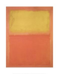
The “multiforms” of Mark Rothko seemed to me an ideal way to juxtapose image and abstraction.
Rothko himself described these paintings as possessing a more organic structure, and as self-contained units of human expression. For him, these blurred blocks of various colors, devoid of landscape or the human figure, let alone myth and symbol, possessed their own life force. They contained a “breath of life” he found lacking in most figurative painting of the era. They were filled with possibility…
-From Wikipedia, the free encyclopedia
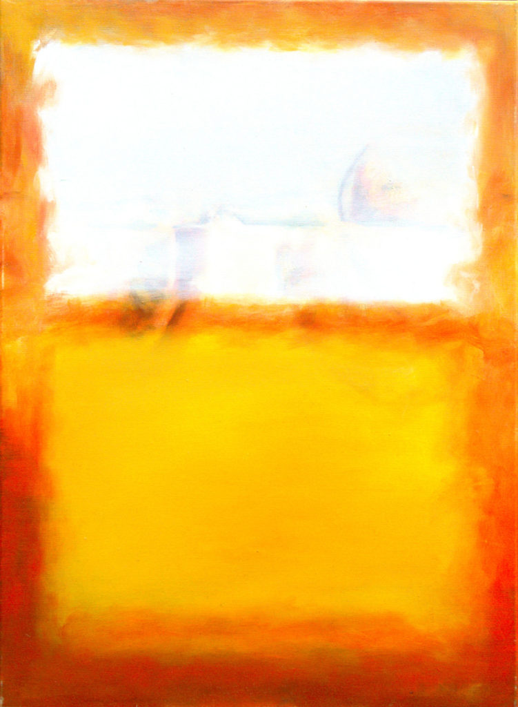
Within the confines of a Rothko-esk block of color, I floated a cocktail of orange slices.
Project: Represent a Realistic Image using the Techniques of an Abstract Painting
Skills Exercised: Imprimatura, Wipeout Method of Underpainting, Painting Wet on Wet, Painting in Value Gradations, Glazing, Scumbling, Impasto
Materials: Water-Mixable Oil Paints, Water, Water Mixable Linseed Oil, Paint Brushes, Canvas/Canvas Paper/primed wood panel
The Palette
In this class, we use water mixable oil paints and mediums. Not only are they better for the environment (water is used as a solvent), they’re also much better for our health in a crowded classroom (less toxic fumes).
My painter’s box includes the following Winsor & Newton Water Mixable Oil Colours, as suggested by my painting teacher. Other brands may work just as well, but I haven’t tried them myself. All additional colors are either mixed on the palette or created through glazing onto the painting.
- Yellow Ochre
- Cadmium Yellow Pale Hue
- Burnt Umber
- Burnt Sienna
- Permanent Alizarin Crimson
- Cadmium Red Hue
- Cerulean Blue
- French Ultramarine
- Viridian
- Titanium White
I also use a bottle of Winsor & Newton Artisan Water Mixable Linseed Oil
The Method
Despite the transition to abstraction, the class continued to follow the painting process that we established in previous lessons. Our naturalistic objects of choice were hidden within the underpainted layers. Once they were established, the abstract oil painting was introduced on top.

Notes
- The orange slices in the underpainting were originally bright orange. As I began to lay abstract layers on top, only the French Ultramarine shadows remained evident.
- Rothko’s finished paintings are seemingly very simple. Creating them is not. When she saw that I’d selected Mark Rothko’s Orange and Yellow, Marilou van Lierop noted, “That’s going to be very difficult.” Several layers of paint are necessary to achieve the variations of color, and many techniques (wet on wet, dry brush, glazing) to create the edges and internal spaces of the “multiforms”.
- I originally applied Lemon Yellow (not a part of the original palette) for the lower block of color. I thought that a transparent color would work nicely with the objectives of the project. I disliked it very much and mixed my own yellow using Titanium White and Cadmium Yellow Pale Hue.


