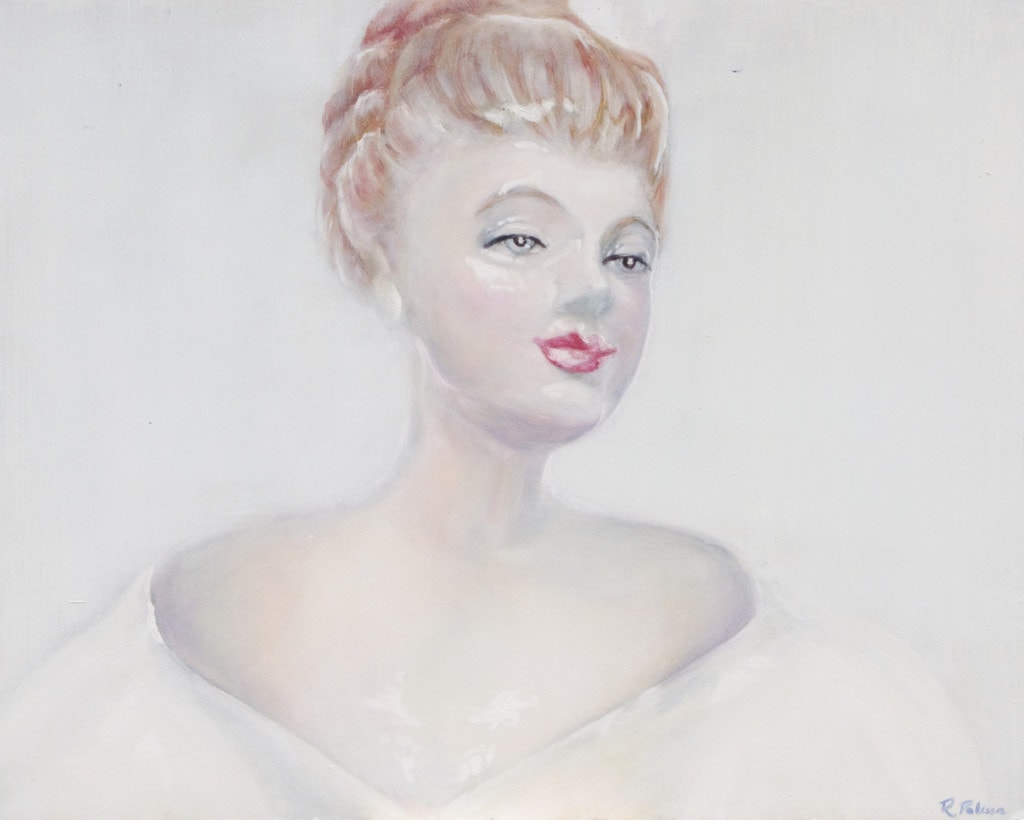
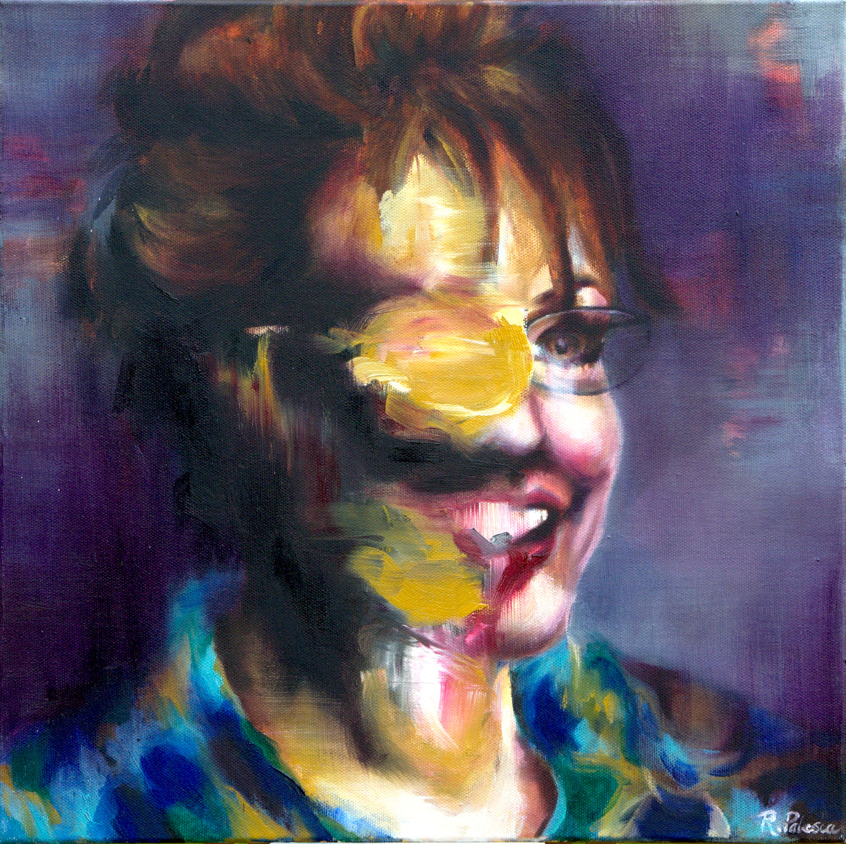
Imprimatura is an incredibly simple layer of an oil painting, but it can affect both the process and outcome of an entire artwork. It can be done in different ways, using any color of the artists’ choosing. Maybe that’s why I find it so interesting. A wash of color that is usually hidden under layers of paint reveals much about the artist, his technique, and his vision for the work.
Imprimatura is a term used in painting, meaning an initial stain of color painted on a ground. It provides a painter with a transparent, toned ground, which will allow light falling onto the painting to reflect through the paint layers. The term itself stems from the Italian and literally means “first paint layer”. Its use as an underpainting layer can be dated back to the guilds and workshops during the Middle Ages; however, it comes into standard use by painters during the Renaissance, particularly in Italy.
The imprimatura provides not only an overall tonal optical unity in a painting but is also useful in the initial stages of the work, since it helps the painter establish value relations from dark to light. It is most useful in the classical approach of indirect painting, where the drawing and underpainting are established ahead of time and allowed to dry. The successive layers of color are then applied in transparent glaze or semi-transparent layers.
Imprimatura in Art History
In the Early Flemish Technique of oil painting, as described by Virgil Eliott in Traditional Oil Painting: Advanced Techniques and Concepts from the Renaissance to the Present, an artist would first transfer a carefully-planned drawing onto a primed wood panel, strengthen the lines with ink or paint, and then isolate the drawing under a layer of varnish. Sometimes a transparent toner was added to the varnish, and that toner is what we know as imprimatura. This layer “could be left to dry as an even layer covering the entire panel, or the lighter areas of the design could be wiped out with a rag… while the imprimatura was wet.”
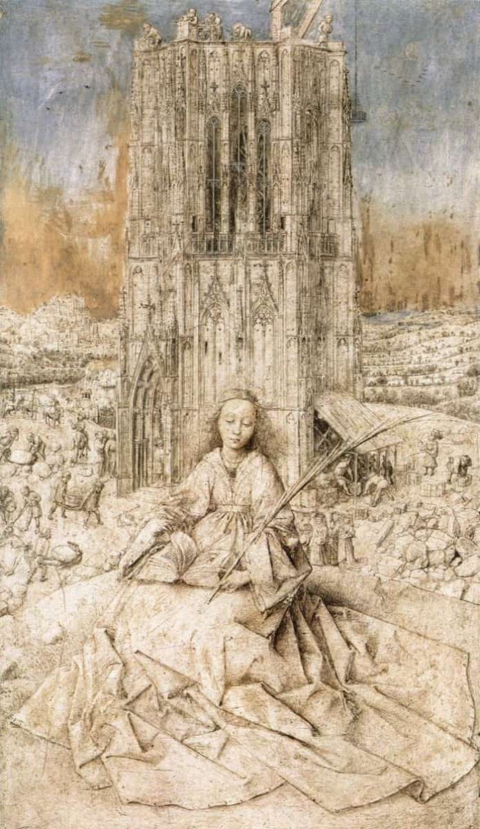
The primary layers described by Elliott are clearly visible in Jan van Eyck’s unfinished Saint Barbara. The meticulous preliminary drawing is submerged in a transparent yellow imprimatura, and subsequent layers of paint begin to define the sky in the background.
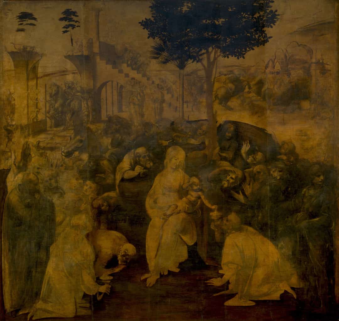
We can see Leonardo da Vinci’s use of imprimatura in his unfinished painting, the Adoration of the Magi. The yellowish ground is clear in the background and in the many figures which were never to be fully modelled by the master’s hand.
How to Use Imprimatura in Your Oil Painting
When used in contemporary painting, imprimatura may come in many forms. You may opt for a warm or cool color to set the mood of the work. Paint in a low or high value to define overall brightness. Lay in a tonal grey wash, and omit color completely. The possibilities are endless, it’s your job as an artist to decide what works best for you.
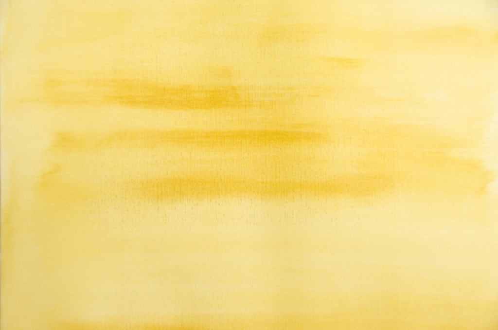
In this tutorial, we’ll use Yellow Ochre. It’s a popular choice for imprimatura because it combats the yellowing effect that occurs as an oil painting ages. It also has a value of 5 (on a scale of 1-10), which makes it perfect for defining the midtones of your painting.
Materials:
- Yellow Ochre Oil Paint (or another color of your choosing)
- Odorless Mineral Spirits
- Wide Hog Hair Paint Brush
- Palette Knife
- Painter’s Palette
- Canvas, Canvas Board, Primed Wood Panel, or Canvas Paper
Process:
 1. Squeeze the paint onto the palette.
 2. Using your palette knife, add a few drops of OMS (Odorless Mineral Spirits) to the paint (or water if you’re using water-mixable oil paints).
 3. Mix well. The resulting mix should be soft, like pudding, but not watery. If you need a little more OMS, add more, a few drops at a time, until you reach the desired consistency.

A word of caution:
While it’s tempting to thin your imprimatura color with turpentine or odorless mineral spirits (OMS) to a near watercolor consistency, it may not be advisable. That is, if you’d like your painting to last. In Traditional Oil Painting: Advanced Techniques and Concepts from the Renaissance to the Present, Virgil Elliott cautions against the use of both solvents and mediums in oil painting.
There is a widespread belief that thinning with solvent makes the paint leaner, and that this is therefore desirable in the early stages of painting. This practice could well cause adhesion problems between layers, as the excessive amounts of solvent normally used in this procedure could weaken or destroy the binding power of the vegetable oil in the paints thus thinned, leaving an underbound layer between the ground and subsequent layers of paint.
He suggests to use the absolute minimum amount of solvents and mediums needed to achieve a desired effect, and whenever possible, to avoid them completely. Using a stiff paintbrush helps to thin out the colors on the painting surface with little to no added medium. If you must thin your imprimatura layer, use only a few scant drops of solvent.

4 thoughts on “Using Imprimatura in Oil Painting”