This post is the second in a series of oil painting project tutorials derived from coursework completed at Academie Noord in Brasschaat, Belgium. Projects were designed by Schilderkunst teacher Marilou van Lierop. The sample artwork is my own.
In the 1960s, German artist Gerhard Richter began compiling a series of newspaper clippings and photos of everyday life. He arranged them onto loose sheets of paper in an album he named Atlas.
Gerhard Richter’s life and art interrelate in Atlas in a multilayered way: banal subjects such as a toilet roll [Sheet: 14] are juxtaposed with horrifying Holocaust images [Sheets: 16–20]; serial landscape pictures are lined up with intimate family photographs; colour samples attached to source images can be found as well as photographs showing museum installations. On the basis of its complexity and diversity, the importance of Atlas exceeds simple documentation, and Atlas is widely considered as an independent artwork.
– from www.gerhard-richter.com
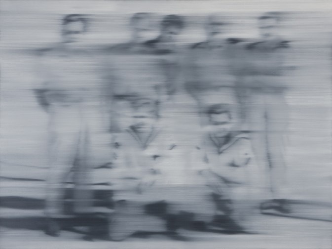
Several of these images became the artist’s source material for a series of Photo Paintings. The technique varies, but in many, the picture appears blurred or wiped away after completion. In Matrosen (Sailors), for example, it looks as if he painted the entire scene and then passed over it with a dry brush.
You can view the complete series of Richter’s Photo Paintings here.
Marilou van Lierop, my painting instructor at Academie Noord, saw Richter’s technique as an opportunity to teach selective focus, and also to challenge us to paint “away from the photograph”. Repeatedly throughout the course, she noted,
We already have the photograph. The goal is to paint something that we don’t have.
Of course, this is my rough translation from her Dutch. In actuality, she may have been saying something entirely different.
Our project was to select a photo, and to choose only one area that we would like to keep in focus. The rest was to be painted “away” in the style of Richter.
Project: Photo Oil Painting Using Selective Focus in the Style of Gerhard Richter
Skills Exercised: Imprimatura, Wipeout Method of Underpainting, Painting Wet on Wet, Painting in Value Gradations, Dry Brush, Impasto
Materials: Water-Mixable Oil Paints, Water, Water Mixable Linseed Oil, Paint Brushes, Canvas/Canvas Paper/primed wood panel
The Palette
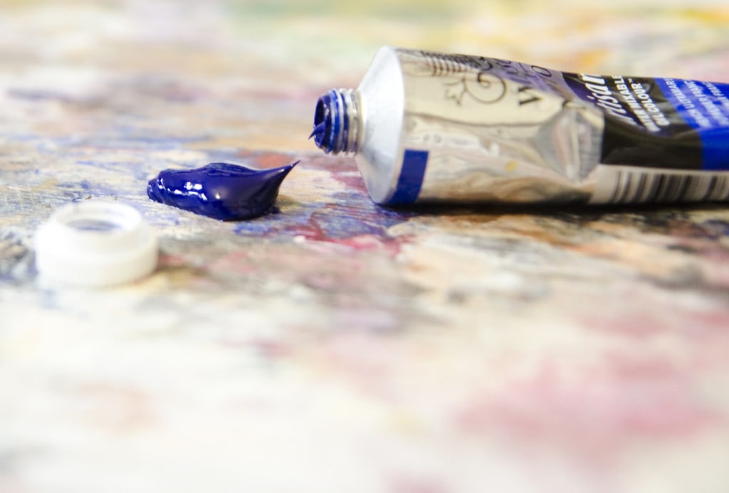
In this class, we use water mixable oil paints and mediums. Not only are they better for the environment (water is used as a solvent), they’re also much better for our health in a crowded classroom (less toxic fumes).
My painter’s box includes the following Winsor & Newton Water Mixable Oil Colours, as suggested by my painting teacher. Other brands may work just as well, but I haven’t tried them myself. All additional colors are either mixed on the palette or created through glazing onto the painting.
- Yellow Ochre
- Cadmium Yellow Pale Hue
- Burnt Umber
- Burnt Sienna
- Permanent Alizarin Crimson
- Cadmium Red Hue
- Cerulean Blue
- French Ultramarine
- Viridian
- Titanium White
I also use a bottle of Winsor & Newton Artisan Water Mixable Linseed Oil
Part One: Imprimatura and Drawing
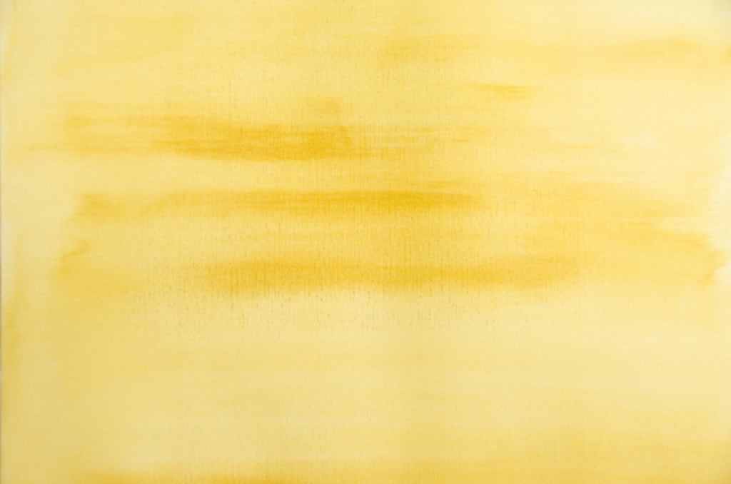
We begin by spreading a thinned yellow ochre wash over the entire painting surface. This is known as imprimatura. It helps to break up the white of the canvas, to establish a mid-tone ground, and to help mitigate the yellowing that occurs during the aging of an oil painting. Since in this class, we use water mixable oil paints, we thin the paint by mixing it with water. If you’re using normal oil paints, you would thin with turpentine or odorless mineral spirits.
For more information and guidelines about imprimatura, click here.
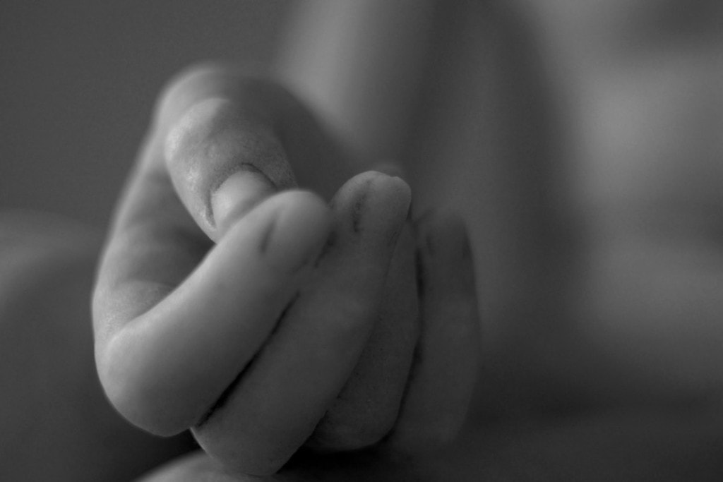
Set up your source image next to your canvas. Mine was this close-up of a sculpture that I found on Flickr. I’m no longer able to find it in order to give proper attribution, but if you do have any information, please let me know. It’s a beautiful photo, and a work of art in its own right.
With a charcoal pencil, lightly block in your subject on your yellow ochre background. Begin with broader shapes, then progress on to the finer details. Mistakes can be erased using a dry rag.
Once you’re comfortable with your drawing, leave the painting to dry overnight.
Part Two: Wipeout Underpainting
Now you’re ready to create a 3-tone wipeout underpainting, using your photograph as a guide.
Begin by squeezing some ultramarine blue oil paint onto your palette

and thinning it with just a few drops of water. Again, in this class, we use water mixable oil paints, and we thin the paint by mixing it with water. If you’re using traditional oil paints, you would thin with turpentine or odorless mineral spirits.
Lightly paint in the dark areas. Load only a small amount of paint on your brush, and wait until there’s none left before reloading. You want to keep this layer as thin as possible. Remember to paint in the dark areas of the background as well as in the figure.
Next, use a clean rag dipped in water (if you’re using water mixable paints) or turpentine/odorless mineral spirits (if you’re using traditional oil paints) to wipe out the lights. Remember to wipe out the light areas of your background as well as in the figure.
I didn’t capture my painting at this stage, but here’s a good example from another project.
Since you’ve used the midtone yellow ochre as a base layer, you now have an underpainting with the three major tonal areas defined. It may not be too pretty, but this is actually an excellent starting point that will guide you through the rest of the painting process. Give yourself and your painting a rest, and allow it to dry overnight.
Part Three: the Overpainting
This is where the real magic happens. You’re now going to begin painting in value. If you’re a beginner, I would suggest starting with black and white. If you’re looking for a challenge, go ahead and paint in color.
Premix all your colors and/or values on the palette. This step needs to be completed quickly, before the paint has a chance to dry on the canvas. So you’ll want to have everything ready in advance.
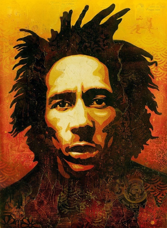
Get ready to paint at record speeds. Start by laying in your darkest darks. You might want to thin your colors with a few drops of Winsor & Newton Artisan Water Mixable Oil Painting Mediums or Winsor & Newton Refined Linseed Oil, and paint thinly with a stiff bristle brush (a hog bristle filbert works well). You don’t want to see any brushstrokes at this stage, and you do want some of the underpainting to show through. When you’re finished laying in the darks, move on to the next value, but keep each value separate from the one before. Slowly work through your value string until you get to the lights. The above image of Bob Marley by Shepard Fairey gives a very clear example of how your value painting should look.

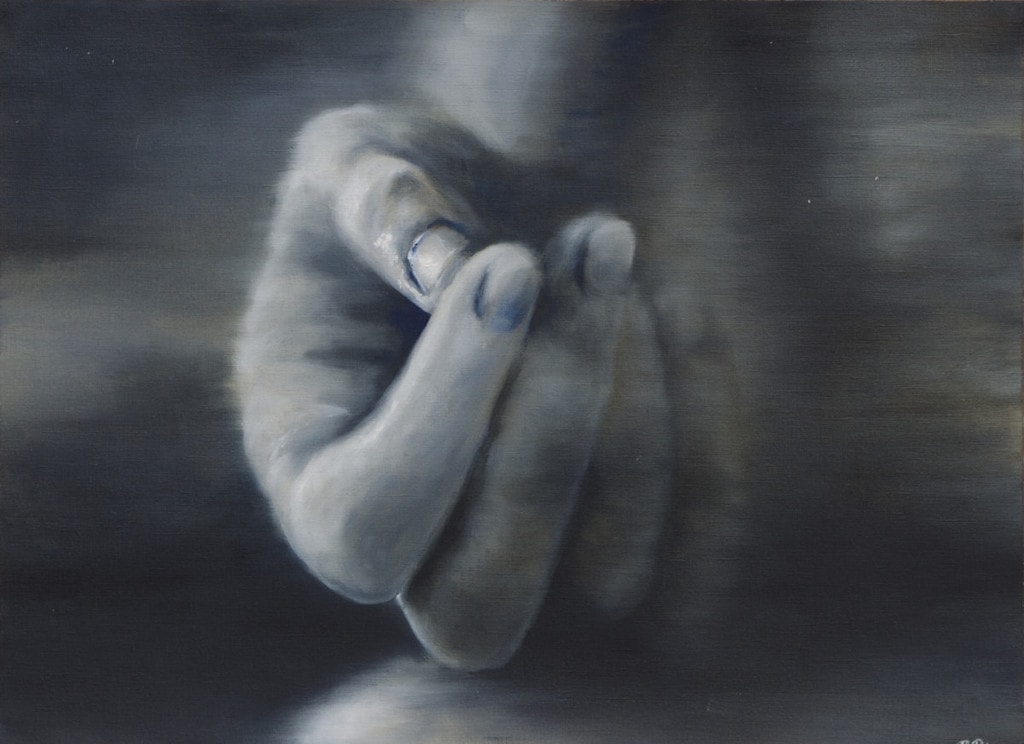
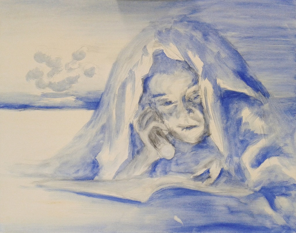
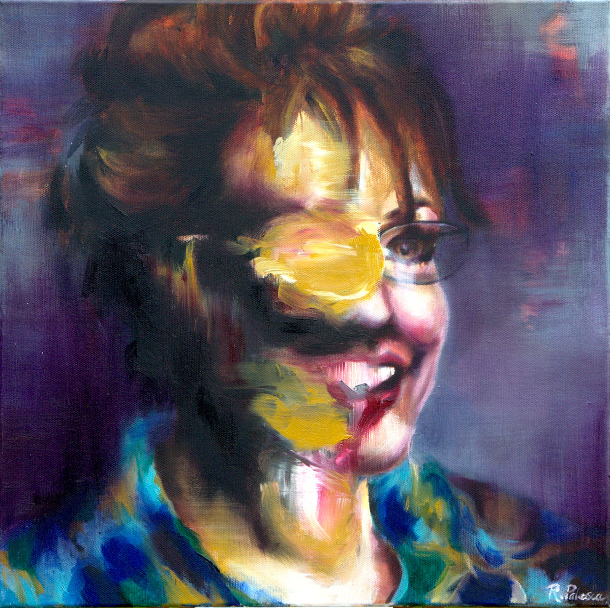
When you feel you have the values right, and your painting has some depth, grab a large, dry, stiff bristle brush. Pass your brush over the entire painting, from one side to the other, smudging and mixing the values together. If you think of your painting as being divided into horizontal rows, you’ll probably end up doing one swipe over each row, changing direction for each. You can brush over the area that you’ve chosen to keep in focus, or not. It’s up to you. In my painting, I chose to keep the thumb and lower parts of the index finger in focus. In the detail above, you can see how I’ve dry brushed over the surrounding areas. You can also see some of the yellow ochre imprimatura showing through.
Leave your painting to dry. Depending on the thickness of your paints and colors used, this may take a few days to a week.
Part Four: Define the Focal Points

Return to your painting, and refine the edges of your “in focus” section. You can paint in more values, refine shapes, strengthen darks, and work up highlights. As the artist, you decide what your painting needs. In my thumb, I did all of the above. You can see the transparent darks and thick impasto highlights that I added to the thumb in this detail.
…and here is my finished painting. If you’ve painted along, I’d love to see yours. Please share a photo or link to your artwork in the comments.

